
Philly Truce - Safety Management App
Philly Truce aims to develop a digital platform that allows Safe Path Monitors and Peace Patrollers to better document and manage incidents they encounter. The creation of this platform would allow Philly Truce to more effectively manage incidents, improve the deployment of Safe Path personnel, and better engage community members in helping curb violence in and around Philadelphia neighborhoods, improving the overall effectiveness of its violence reduction programs.
Philadelphia, Pensilvania
2020
Non-Profit
10+
Challenge
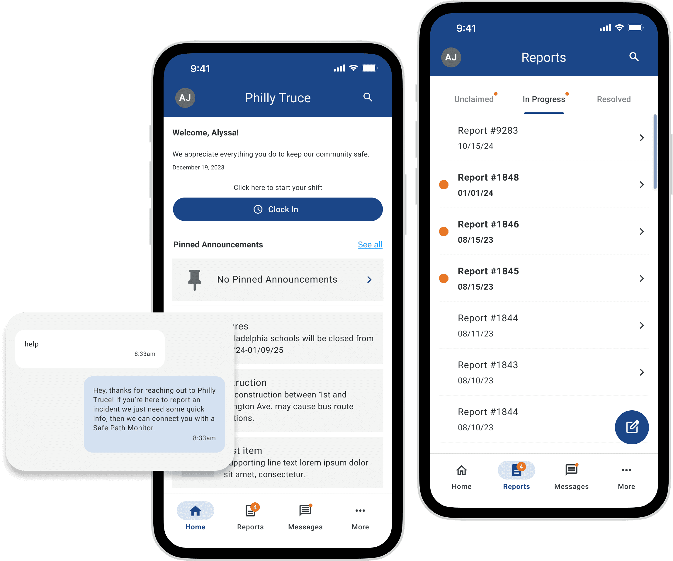
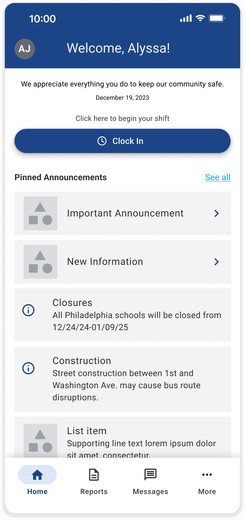
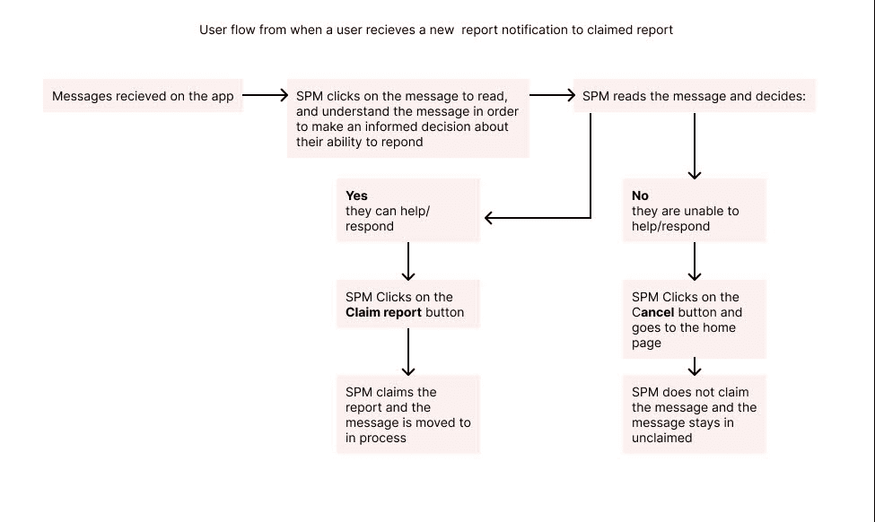
In this phase of Philly Truce app production, the goal was to create a user-friendly digital platform for Safe Path Monitors (SPMs) and Peace Patrollers to document incidents efficiently, including features for creating, claiming, owning, editing, and closing reports. Aligning with business goals, this enhances operational efficiency by replacing the absence of record keeping, allowing for real-time data capture and analysis. This directly supports Philly Truce's mission of improving community safety and reducing violence.
Results
The improved reporting process resulted in a 98% increase in SPM approval rates.
The addition of CTA's and omission of redundant options enhanced user engagement, leading to an increase in communication retention rates.
An improved design system for further iterations and feature design.
“ I feel like it was useful. Easy to understand it.”
"I feel like the questions are pretty accurate."
The Process at a Glance
Research & Analysis: We conducted four moderated and unmoderated user interviews and analyzed analytics to understand the pain points in performance, tone, and clarity of call to actions for the app. We also studied the time it took for users to complete the tasks with the previous designs.
Information Architecture: Based on the research findings, we restructured the app's navigation and content, prioritizing features and information according to user needs and the urgency of the matters being reported.
Wireframing & Prototyping: We designed high-fidelity wireframes derived from previous versions of the features to visualize the new layout and navigation, iteratively refining them based on user feedback. Afterward, we built a high-fidelity, interactive prototype to test the design.
Usability Testing: We conducted usability tests with a diverse group of students to validate the tone of copy in the chatbot and the overall flow of the reporting feature to identify areas for improvement. Based on the feedback, we made necessary adjustments to the copy and design - ensuring that the user felt comfortable to use. The initial worry in the first sprint was that users weren't receiving a full experience when testing, so we made sure to make the prototype as close to finished as possible in a timely manner.
Testing usability with students presented several blockers as we awaited legal and parental approval. Towards the fourth and last sprint we were able to gather students with full approval and move forward with content iterations for their interaction with the app.
We used moderated and unmoderated testing but found that some feedback was not usable due to distractions during the unmoderated testing.
Visual Design & Style Guide: We developed a cohesive visual language, including color schemes, typography, and iconography, ensuring consistency throughout the app. We also created a style guide to maintain design consistency in future updates and future teams.
An In-Depth Look
Research & Analysis
At the beginning of our first sprint, we were initially going to go full force ahead in designing towards our goal. During the audit, we found that some flows were prototype-ready and did not require iterations while others require heavy adjustments to the UI and design continuity.


Information Architecture
While staying in line with the PRD, we paid close attention to how small details could effect the user retention in a major way. We collaborated with our Content team to determine what design changes could be made while keeping the integrity of the intended tone and experience of the app. We were able to come to the following conclusions:
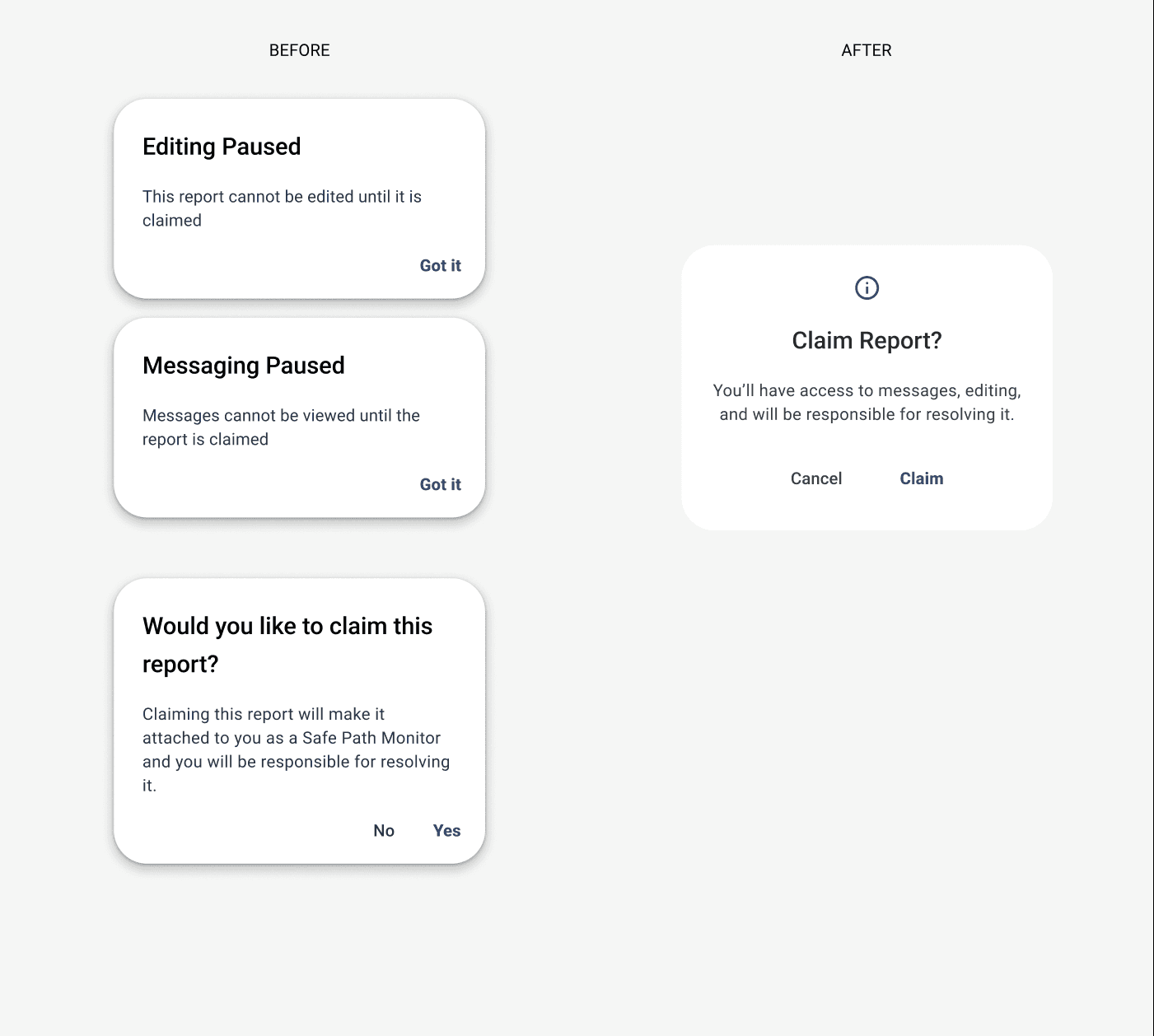
• Consolidate pop-up modals to account for all entry points - Claims report CTA, Messaging Icon, and form fields
• Eliminate icons that were redundant such as "edit" icons while in edit mode
• Clear navigation between report progress screens as well as adjusting the font styles to show messages that have been read and unread
• Add clarifying options to specify the event that occurred

Wireframing and Prototyping
There were many tasks to tackle but the common question amongst our team was how can we solve these issues in two months while keeping the safety of the user in mind. Phase 2 provided a feasible outline. Due to changes within Philly Truce, we had to pivot multiple times. `Ultimately, we were able to deliver a product that later phases could build upon or leave as is.
Because the app requires in-depth information from users, we focused more on getting more with less. To tackle this feat we prototyped the following solutions:
• Utilized radio buttons and checkboxes within the hierarchy
• Quick but effective ways to display edited information in confirming pop-ups
• Made "1-tap" solutions for creating a report
• Create clear and concise notifications
• Utilize the header space for feature icons
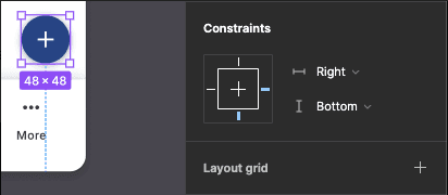
• Utilize constraints for better responsiveness

Usability Testing
Our testing periods consisted of a lot change and consideration as we collaborated with Research and Content. Some changes we noticed before the pain point was confirmed via research. While others were eye-openers and important to fully understand before making iterations. One instance resulting in all teams getting to know our users again. One of our features - the chatbot - is solely used by the student first, then the SPM. During sprint 3, we needed to pivot back to the drawing board of how to gather the correct users for the testing of the feature.
Our research team also has to pivot as they switched testing platforms and scoring to better fit the informative needs of both the Content and Design teams. The Wizard of Oz method, we were able to get the information needed.


Visual Design & Style Guide
We felt it was really important that the style of the app held its integrity. We made it easier for the developers and later design teams to not have to reinvent the wheel and spend more time building out new features.

Conclusion
The Philly Truce mobile app redesign successfully addressed the usability issues, resulting in a more intuitive and user-friendly experience. The improved UX/UI design led to increased user adoption, engagement, and satisfaction.
I learned a lot leading the team and working alongside other team leads. Going forward, I've found it important to understand the team's strengths and weaknesses while also getting to know what it is they wish to grow into. My team did a great job communicating to one another, however being able to speak to our 'why' when advocating for a design choice is equally important,
I would also add auditing company changes that may affect the design process or PRD when auditing designs.
I am grateful to have had the opportunity to lead this wonderful team of designers.
