
TourMe - Learning UX
TourMe is an app that services users who enjoy attending art galleries and those who aspire to have the time to but don’t. TourMe provides the opportunity to check in to tours that the user has booked offline without having to wait by doing so before arriving.
This app was designed while in study for UX Design.

Challenge
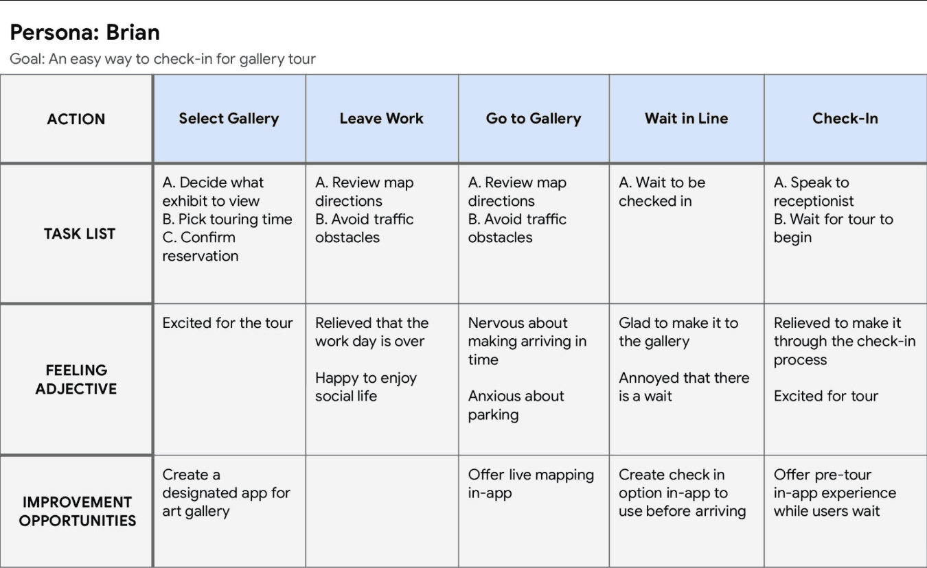
Creating an app that appeals to users with obligations, specific interests, or timing issues that make it difficult to attend tours. Users also expressed the need to complete their goal in a timely manner due to having busy schedules.
Results
Descriptive information for available and booked tours.
Ability to view past and upcoming tours.
Customer incentives for app retention.
“I love this app and idea! Love the images and color theme. The profile page is also visually appealing. I like that the profile pic looks like a hero image as opposed to the usual circle avatar. I also like the idea of points.”

Process
Research & Analysis: I conducted interviews and created empathy maps to understand the users I’m designing for and their needs. A primary user group identified through research were working adults who don’t have time to enjoy galleries due to timing.
This user group confirmed initial assumptions about art gallery attendees, but research
also revealed that time was not the only factor limiting users from taking tours. Other user problems included obligations, interests, or challenges that make it
difficult to attend tours.
Information Architecture: Based on the research findings, I found that it was better to have more than one way to receive and review booking confirmations. Users also wanted more of an incentive to having a profile on the app.
Not only did I take those pain points into consideration, I pivoted from the initial design to a new design to maintain the integrity of clarity.
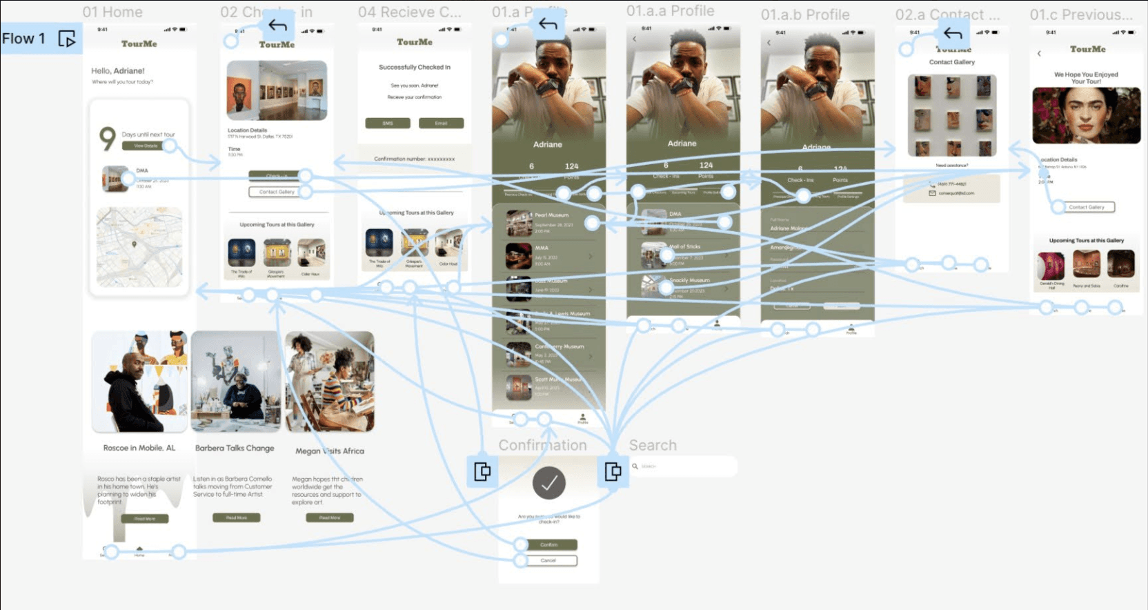
Wireframing & Prototyping: The final high-fidelity prototype presented cleaner user flows for checking in to a tour and tracking past and future check-ins.
Usability Testing: Usability testing produced the following findings:
Round 1
• Users found the process to be repetitive
• Users didn't understand the beginning of the process
Round 2
• Users wanted more descriptive information for touring
• Users felt that the transitions could be better
• Users were concerned about being able to see past confirmation numbers


Conclusion
If I were to continue the design of this product, I'd perform more usability studies to ensure that the users' needs are met. I'd discover more ways to make the app a one-stop-shop for gallery touring. Lastly, I'd make the necessary iterations to the design system and make the app more inviting.
